A Gamified App Launch to Help Smokers Quit
My Responsibilities
Usability Studies
UI/UX Design
Visual Direction
Prototyping
Tools
Sketch
Miro
Principle
Role
Senior Product Designer
Project Length
6 months
Background
Pfizer, in partnership with the American Lung Association, set out to create Quitter’s Circle, a support system for smokers looking to quit. The vision is to support, to track, and to sustain your quit journey, together.
Our goal on this project was to design and deliver an MVP app that is engaging, accessible, and effective in helping smokers overcome temptation and stay committed to quitting. And, my work focused on visual direction, designing behavior-driven interaction patterns, and ensuring an accessible, motivating journey for users striving to quit smoking.
Problem Statement
Cigarette smoking is still the leading cause of preventable disease and death in the United States. While 85% of smokers say they’re concerned about the health risks, only 36% have a plan to quit. Many existing cessation programs focus on medical treatments but overlook the behavioral and emotional side of quitting. As a result, smokers often struggle with motivation, habit tracking, and long-term commitment.
Studies show that having professional guidance can double a person’s chances of quitting successfully—highlighting a clear need for more holistic, accessible solutions that support both mindset and behavior change.
Key Achievements
Key Insights
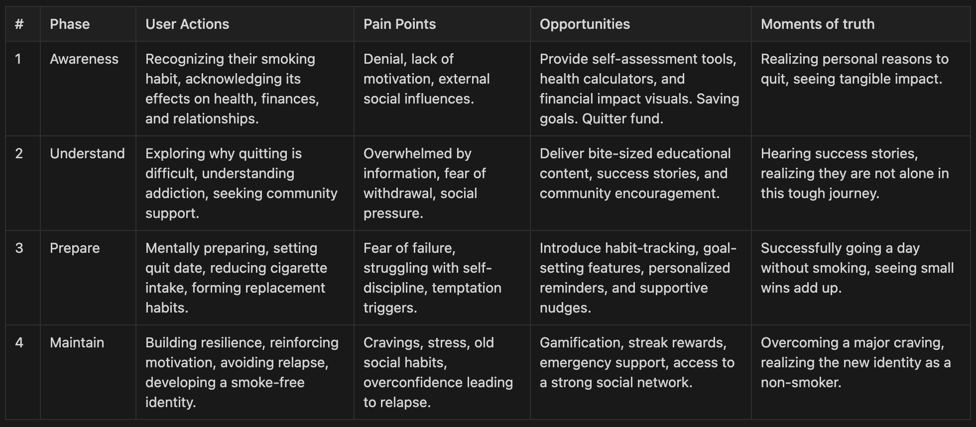
We had access to industry and market data alongside with interview recordings from our partners, along with expert guidance from professional clinicians. This allowed us to cut on assumptions and premature solutions and create a behaviorally informed experience that balances community support and product outcomes.
After analyzing plenty of study recordings, I captured the smokers’ experiences, emotions, thoughts, and pain points throughout their smoking habits and unsuccessful past attempts at quitting. Once presented to stakeholders, we explored bothe business and product opportunities from this discovery. This map became our reference sheet and north star, guiding us in building a user-centered product that resonated with their struggles and motivations.
Onboarding Flow
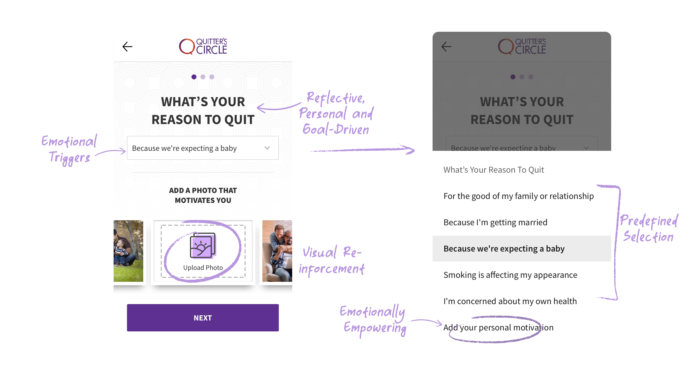
During my exploration of the onboarding flow, I wanted to approach the it by intentionally using an emotional hook, to potentially anchor users right from the very start of their journey. My thought was that it created a more meaningful and motivating entry point into the experience. However, due to a clash of ideas and time constraints, stakeholders ultimately decided not to move forward with it.
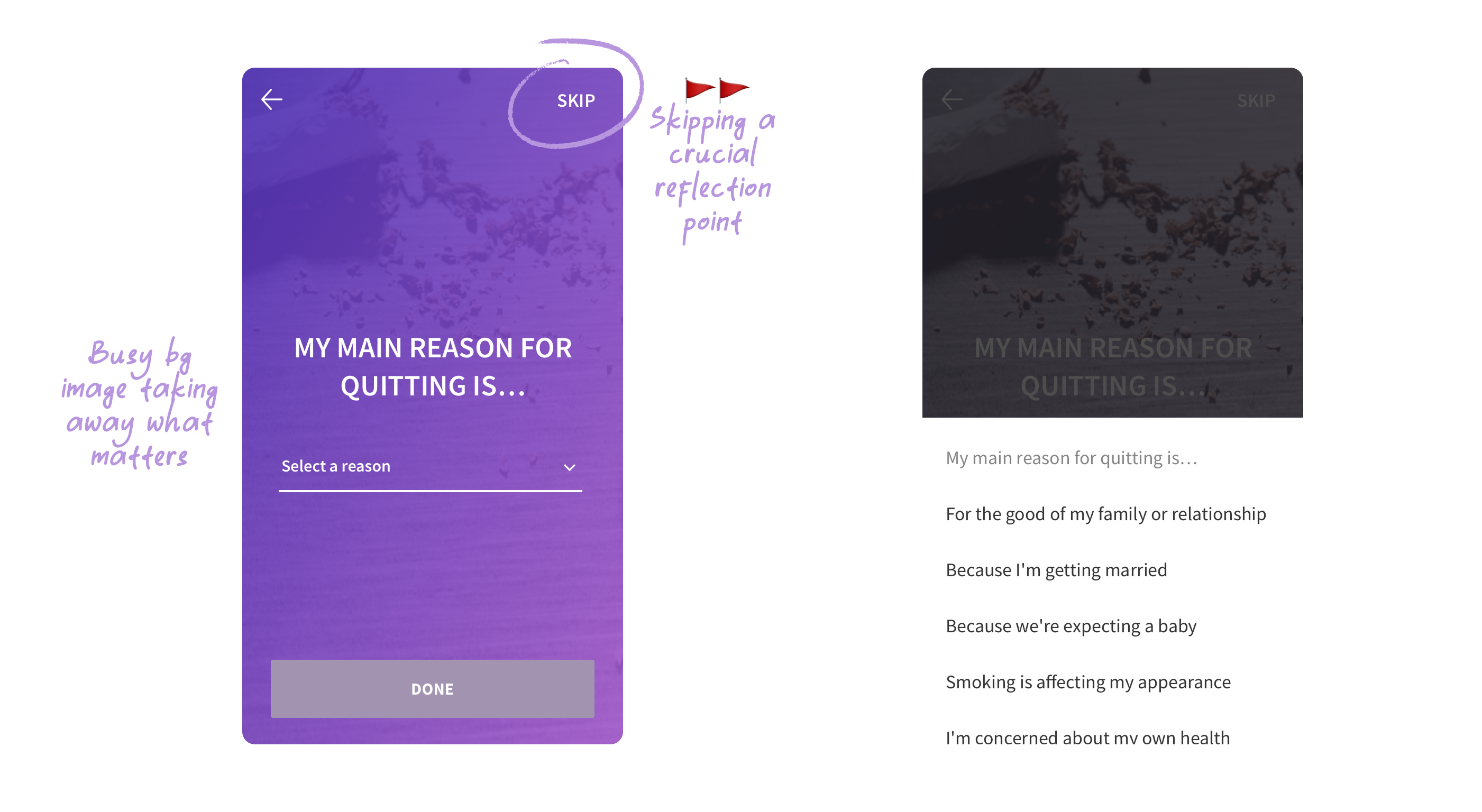
The implementation, allowed users to skip this onboarding step which was a critical mistake in my opinion. Stakeholders saw it as a way to reduce friction in onboarding, however it removed the emotional hook. Instead of feeling invested from the start, they were simply moving through too fast, without a reflection point.
I wanted to explore different options that would remove the predefined selection and go for a more personal touch with a cutom input. Behavioral science shows that we’re more likely to commit to goals we physically write down.
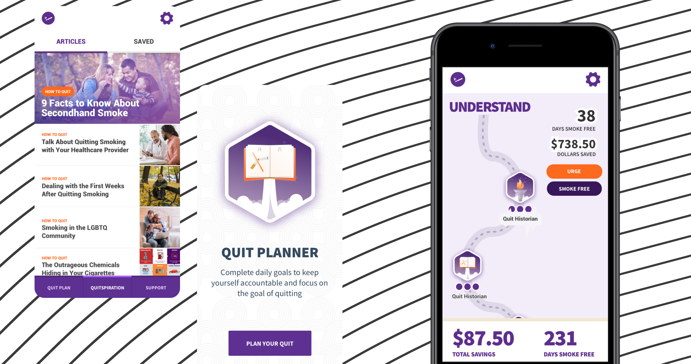
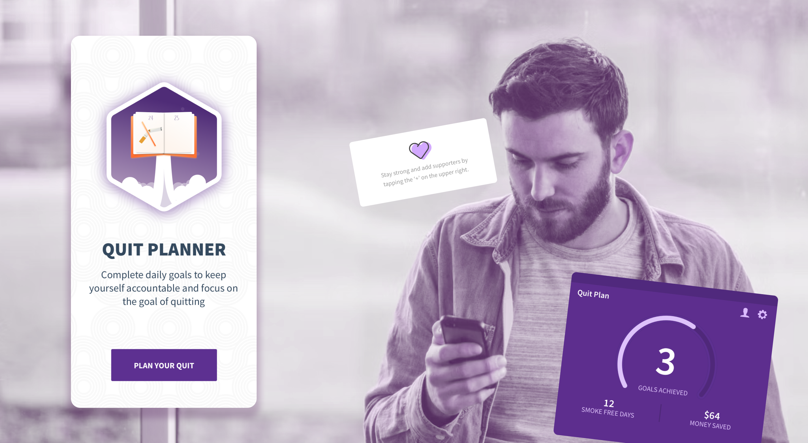
Reinforcing the Journey through Gamification
The sentiment within the group was to push for that strong emotional hook. Post-signup, we saw a clear opportunity to introduce gamification as a way to engage users and get them prepared for triggers and moments of temptation.
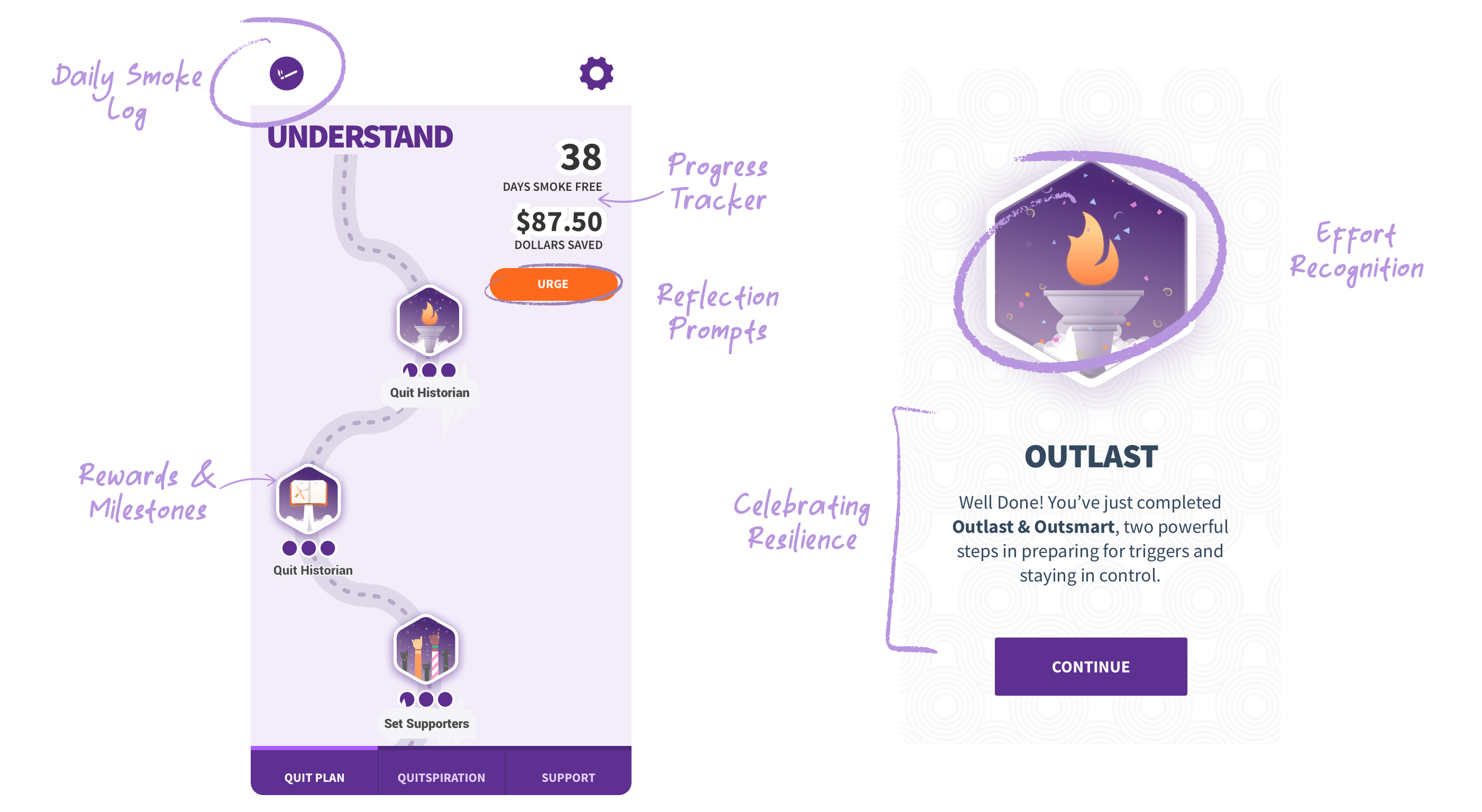
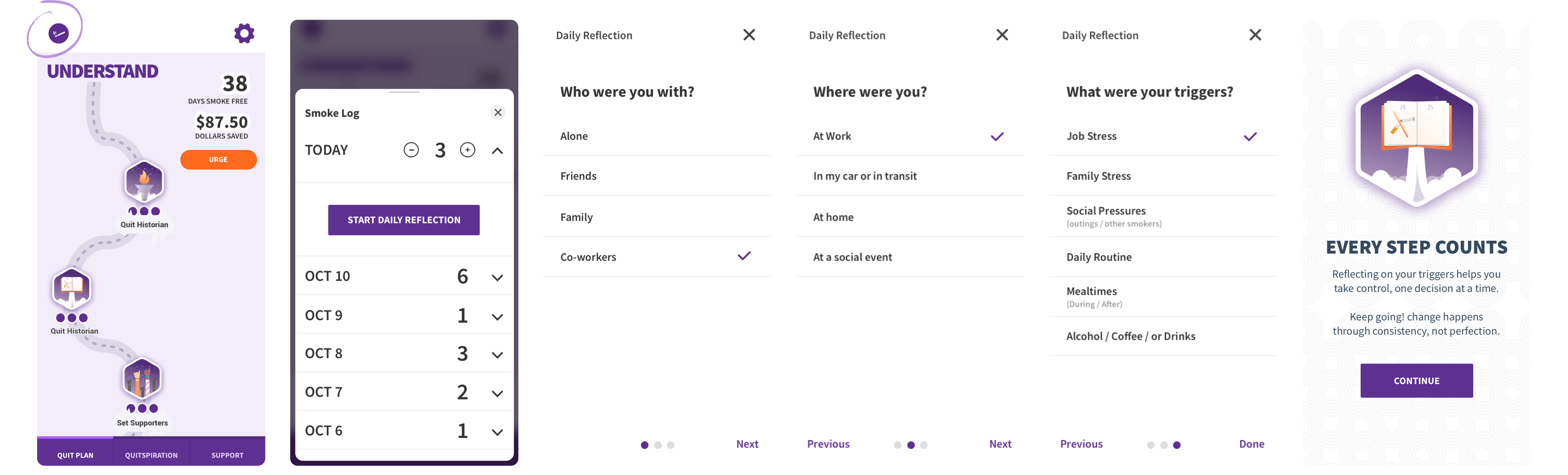
The App's homepage evolved into a journey-inspired, road trip like experience, filled with rewards, motivation, support and earned badges. These revolved around the user's daily smoke log, reinforcing small wins and milestones, and turning the quitting process into something tangible, playful, and progress-driven.
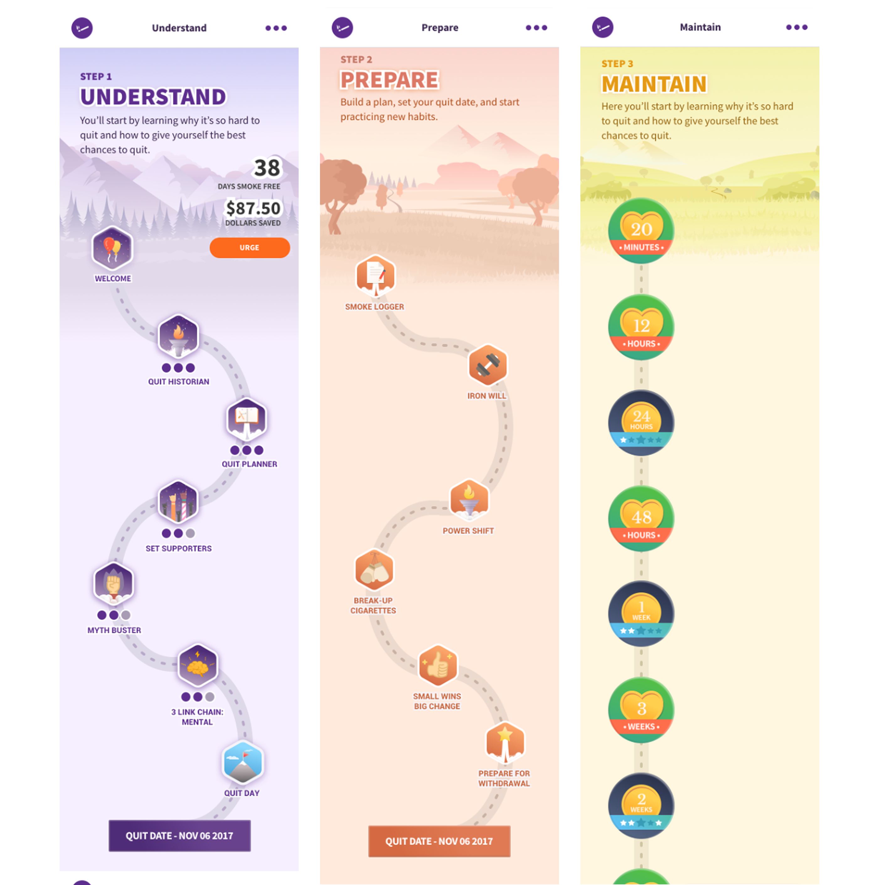
Key Gamification Elements
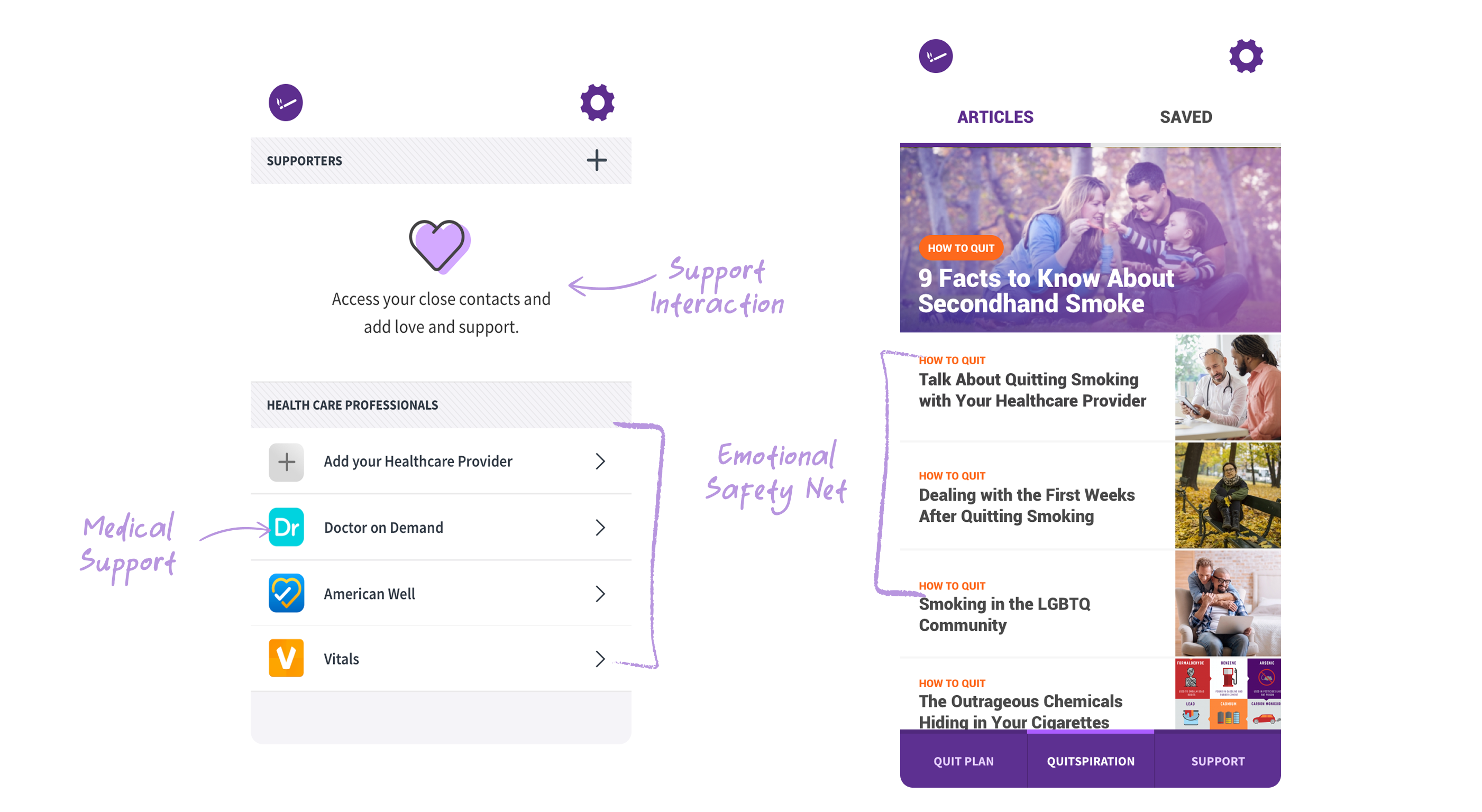
Smoke Log Flow
The Smoke Log was a crucial feature designed to encourage daily engagement by helping users log their smoking activities. By consistently tracking when, where, and why they smoked, users could reflect on their habits and recognize patterns that might be hindering their progress.
This log wasn’t just about self-awareness, it also served as a valuable tool for professional guidance. When consulting a healthcare professional, users could review their smoking history together and identify lifestyle, social, or emotional triggers. This data driven approach allowed for personalized advice and actionable changes.
A design flaw that led to no logs
When the MVP was launched, a small group of users began signing up through Pfizer’s medical partners. Early adoption showed promise, however users encountered a critical issue. There was a low completion rate on the most essential feature which is the Smoke Log.
The smoke log was designed to be a daily routine for self-awareness and behavior change. Our roadmap already included plans to strengthen habit-forming UX, but we hadn’t anticipated such a fundamental flaw in the existing design.
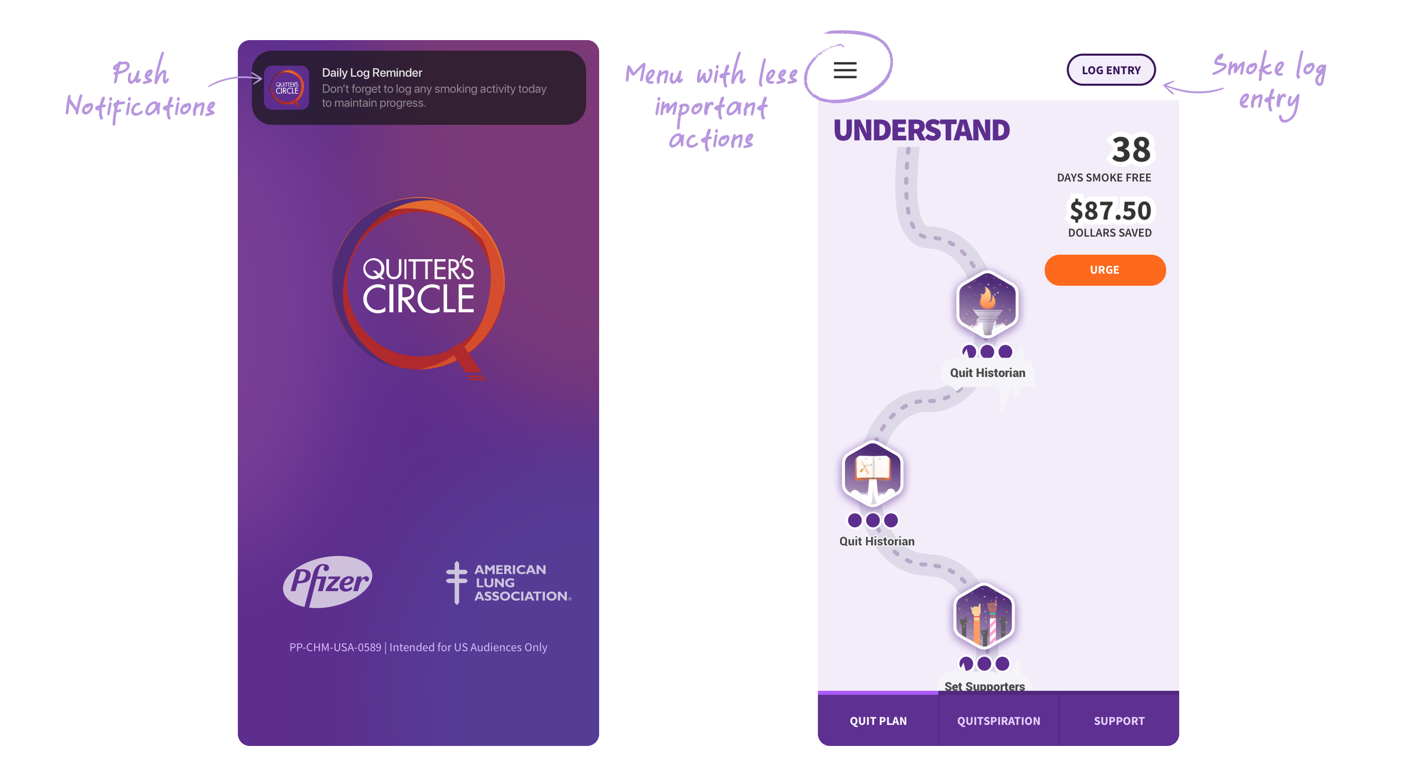
Usability testing and behavior analytics revealed the root of the problem: most users simply couldn’t find the Smoke Log. The icon representing it was often mistaken for the app’s logo, making it unclear that it was an interactive feature.
Action items
This led us on improving engagement through push notifications, testing different messages and timings to remind users to log their activity and help boost completion rates.
I also redesigned the top navigation area and made the smoke log entry more clear.The settings icon was replaced with a menu icon and moved to the left for less important actions. The Smoke Log was renamed to Log Entry, moved to the right, and made easier to find.
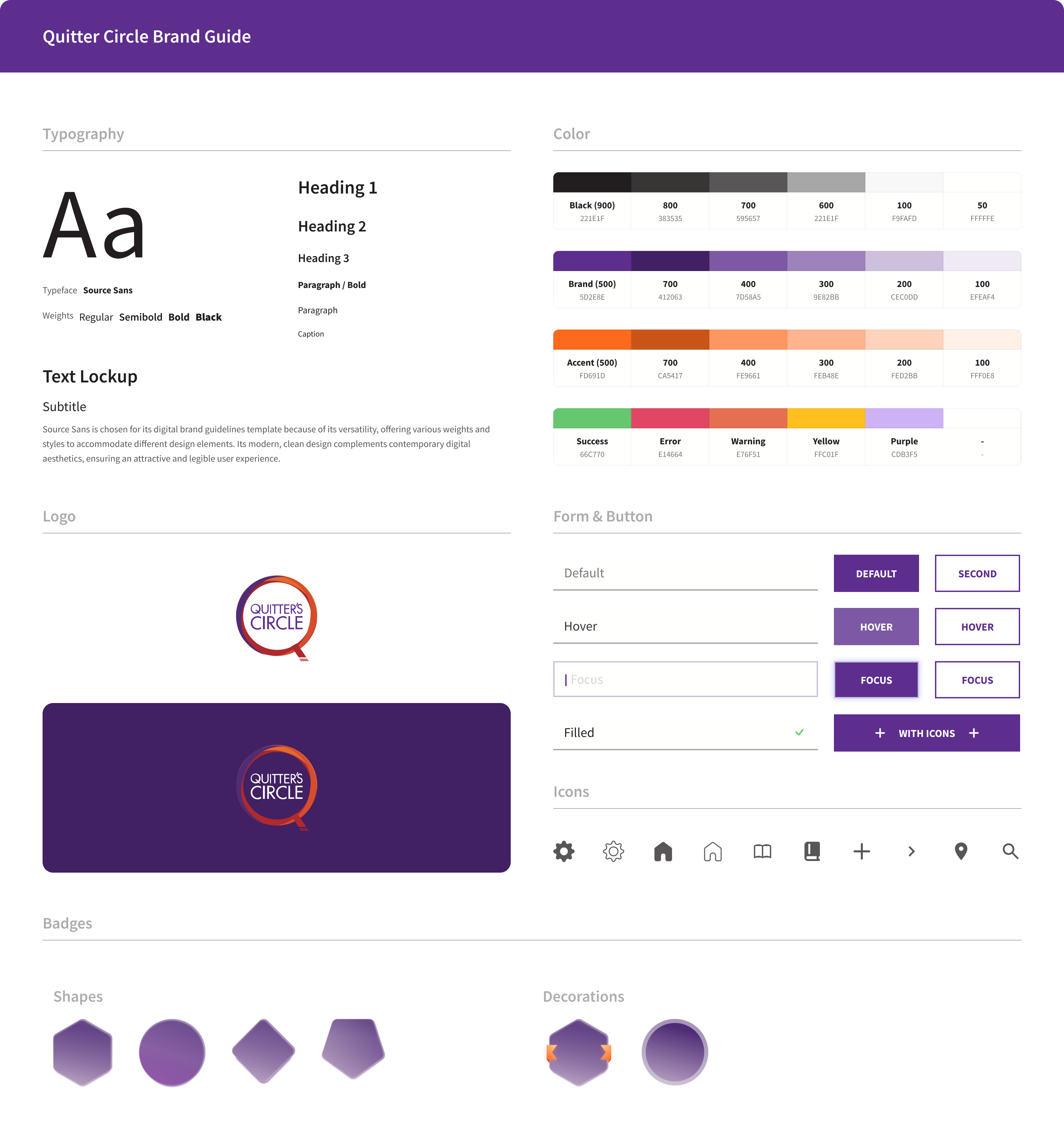
Visual Direction & Consistency
Pfizer had an established marketing identity, providing a strong foundation for Quitter’s Circle’s visual language. So, I took what was there and built a UI Kit in Sketch to make sure the digital experience adheres to consistency and that it support a full range of interaction states, accessibility needs, and behavioral cues.