Simplifying Healthcare in the U.S. Through Telehealth
My Responsibilities
Market Research
UI/UX Design
Brand Direction
Prototyping
Usability Testing
Tools
Figma
Figjam
Google Sheets
Clickup
Role
Founding Designer
Project Length
4 months
Background
Peppermint began as a bold vision to take on and simplify healthcare access in the U.S. an industry regularly dominated by complexity, confusion, and hidden costs.
As the founding product designer, I led the end-to-end experience from discovery to delivery. Working in close collaboration with the idea founder, CTO, and two full stack engineers, we took the idea from initial concept to MVP in just under 8 weeks. This included customer interviews, rapid market research, wireframing, usability testing, and building a validated prototype that clearly demonstrated value to early adopters.
Problem Statement
For many Americans, healthcare is unaffordable, overly complex, and difficult to access. In 2021, approximately 27 million people lacked health insurance (Source) and an estimated 52 million are underinsured, meaning their plans did not cover local doctor visits (Source). With around 700 health insurance companies in the U.S., most doctors only accept between 10 to 20 of them on average, limiting patient options even further.
As a result, patients face long wait times, high medical bills, and limited provider availability, forcing them to either delay care or turn to expensive alternatives like emergency rooms for non-life threatening conditions and creating bottlenecks in the system.
Key Achievements
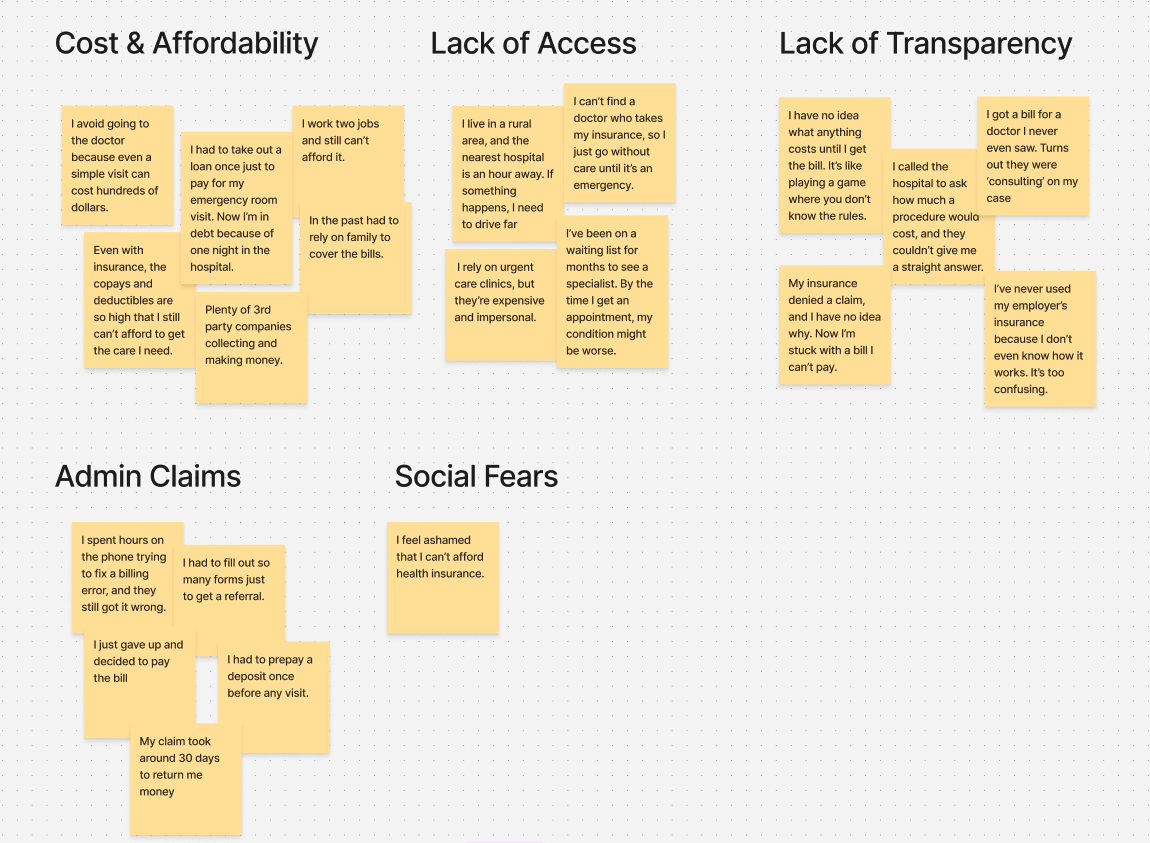
Talking to People
To reduce risk and avoid wasted efforts, I wanted to tap into discovery and captured real user insights, and since none of us had prior experience with the U.S. healthcare system, it would have been presumptuous to deliver a solution to a problem I never personally faced. I took this approach to understand the customer better, and also plan our roadmap around features that would be most valuable. So reached out to Americans and interviewed them. The goal was to understand what people currently do about their health, how they feel about their situation, and what they truly want going forward.
Target Users
Redefined Problem Statement
How might we create a healthcare experience that feels effortless, is affordable, accessible, and transparent for uninsured and underinsured individuals, ensuring they can easily find, compare, and book services that meet their medical needs without overwhelming financial stress.
Strategy & Action Plan
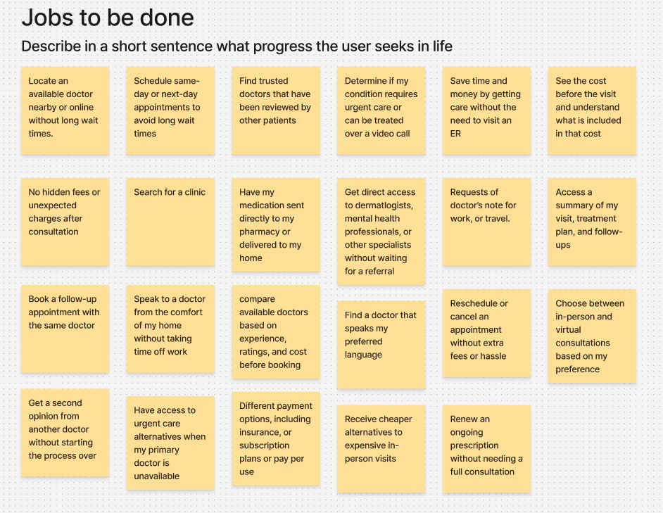
Using insights from user interviews and follow-up questionnaires, I applied the Jobs to Be Done framework to uncover what people were actually trying to accomplish when dealing with healthcare. This helped us focus on the core goals, like finding a trusted and recommended doctor, seeing prices upfront, and booking appointments for both virtual and in-person with ease. These real life cases became the foundation for our initial features and roadmap, ensuring we built around actual user needs, not assumptions.
Shaping the MVP
After bringing in all the insights from talking to users, as a team we then shifted focus on execution and worked our way into defining what MVP0 would look like and the Jobs to be done was instrumental for this.
The high-level product plan consisted of:
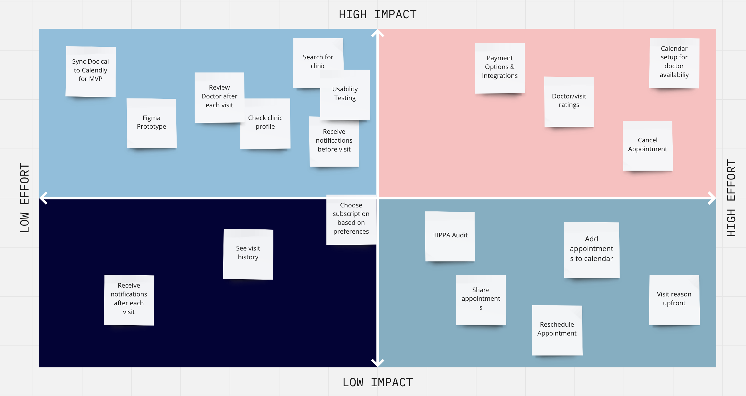
As a team we used an Impact vs Effort Matrix to prioritize features and mapped a lean roadmap from prototype to early landing page launch and usability testing.
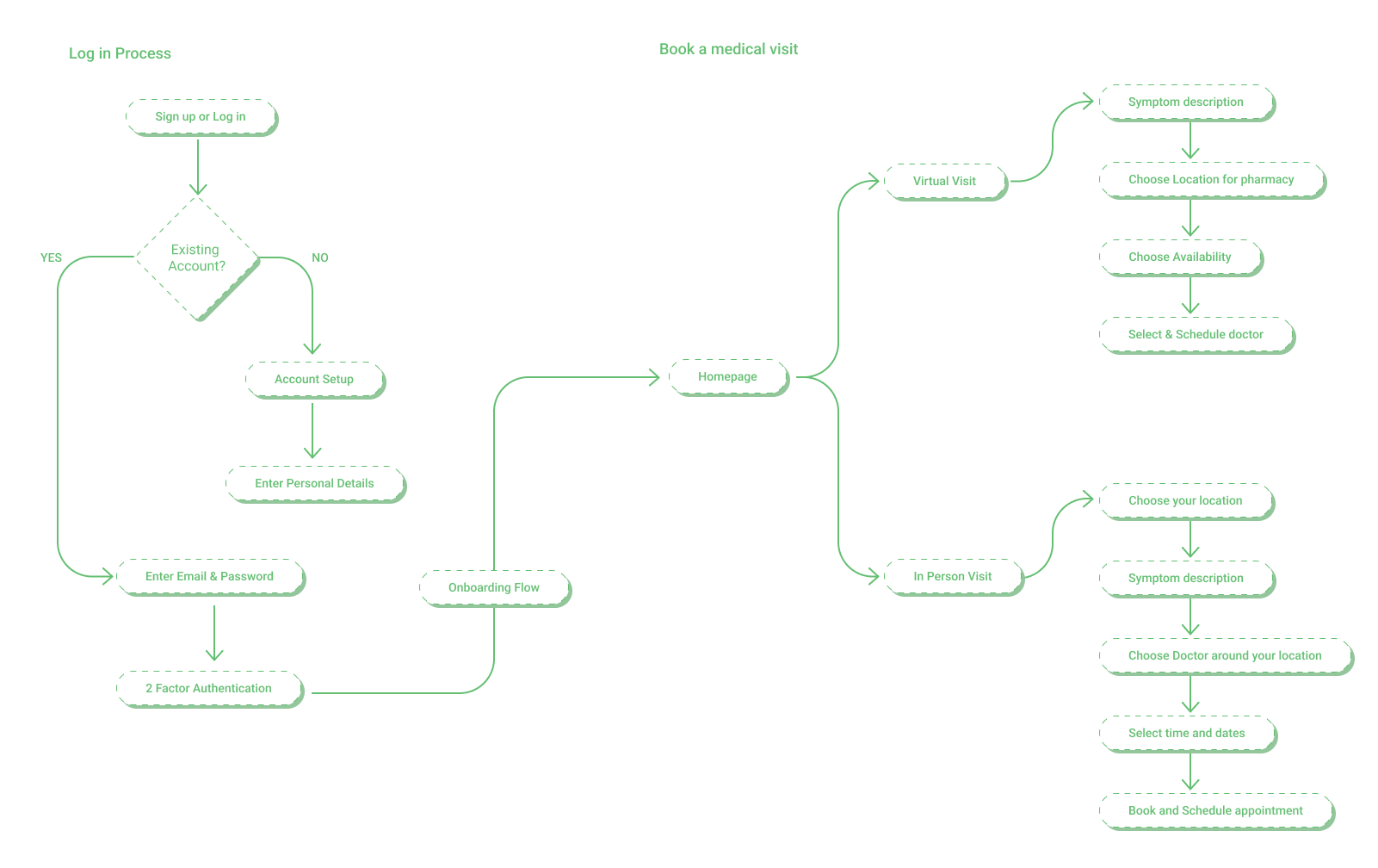
Wireframing
At this stage in the process, velocity mattered. Design began to block engineering from moving forward, yet I still needed to test small and iterate and to avoid costly mistakes down the line. I had to prioritize what to wireframe and not spend too much time wireframing the whole app, so I focused on imporatant user touch points;
Observing Users through Usability Testing
As I moved into building high-fidelity prototypes for the patient app, we made it a priority to keep testing and refining based on real user behavior. We conducted two rounds of usability testing, both focused on high-fidelity mocks to simulate the final experience as closely as possible.
During the first round of testing the first 3 users failed the same task, finding a service and booking the doctor, through a map. This proved to be overly complex, and added significant cognitive load. Users got stuck and repeatedly asked how to proceed, indicating confusion and friction in the experience. This friction, made me pivot the homescreen design from a overly complex map view into a guided 2 way choice stream.
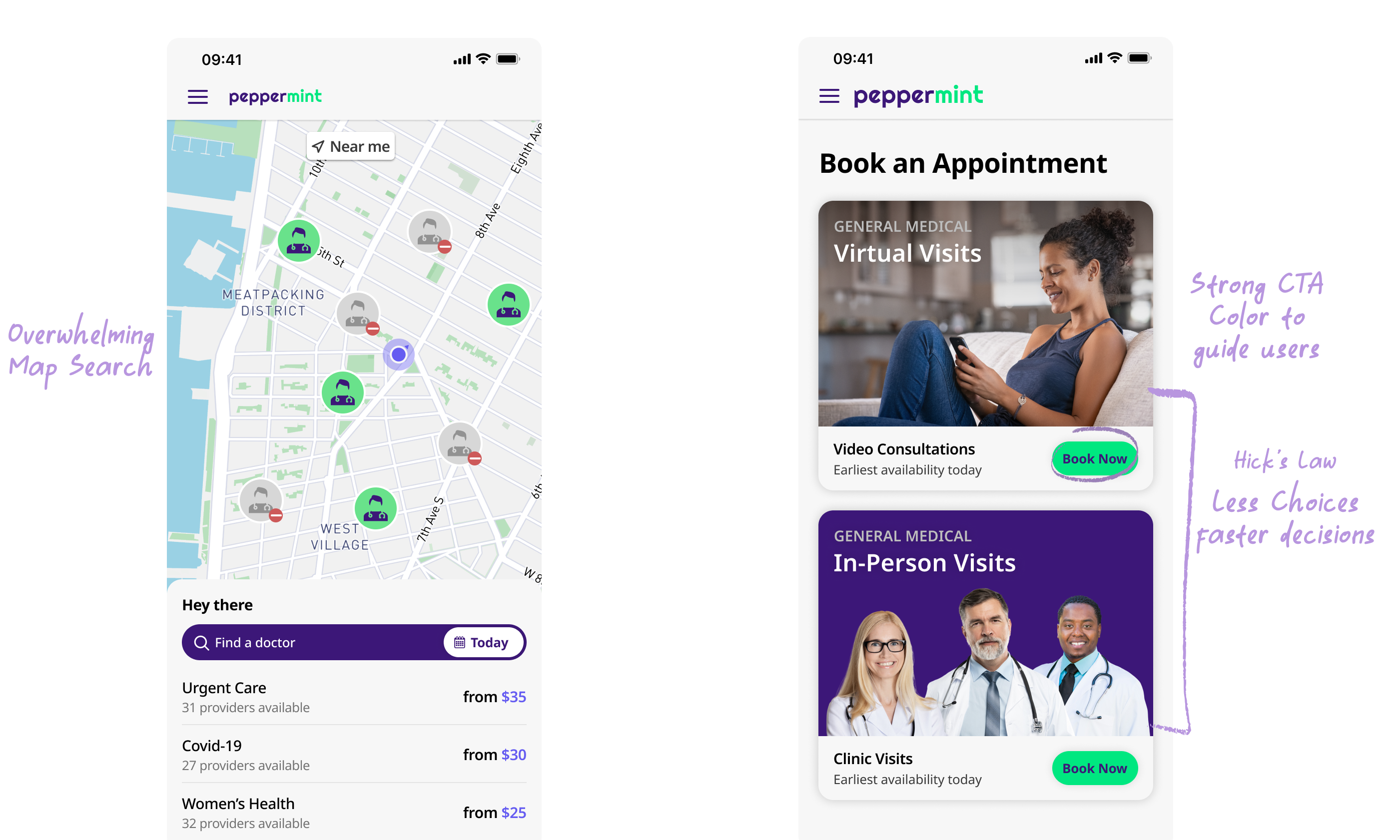
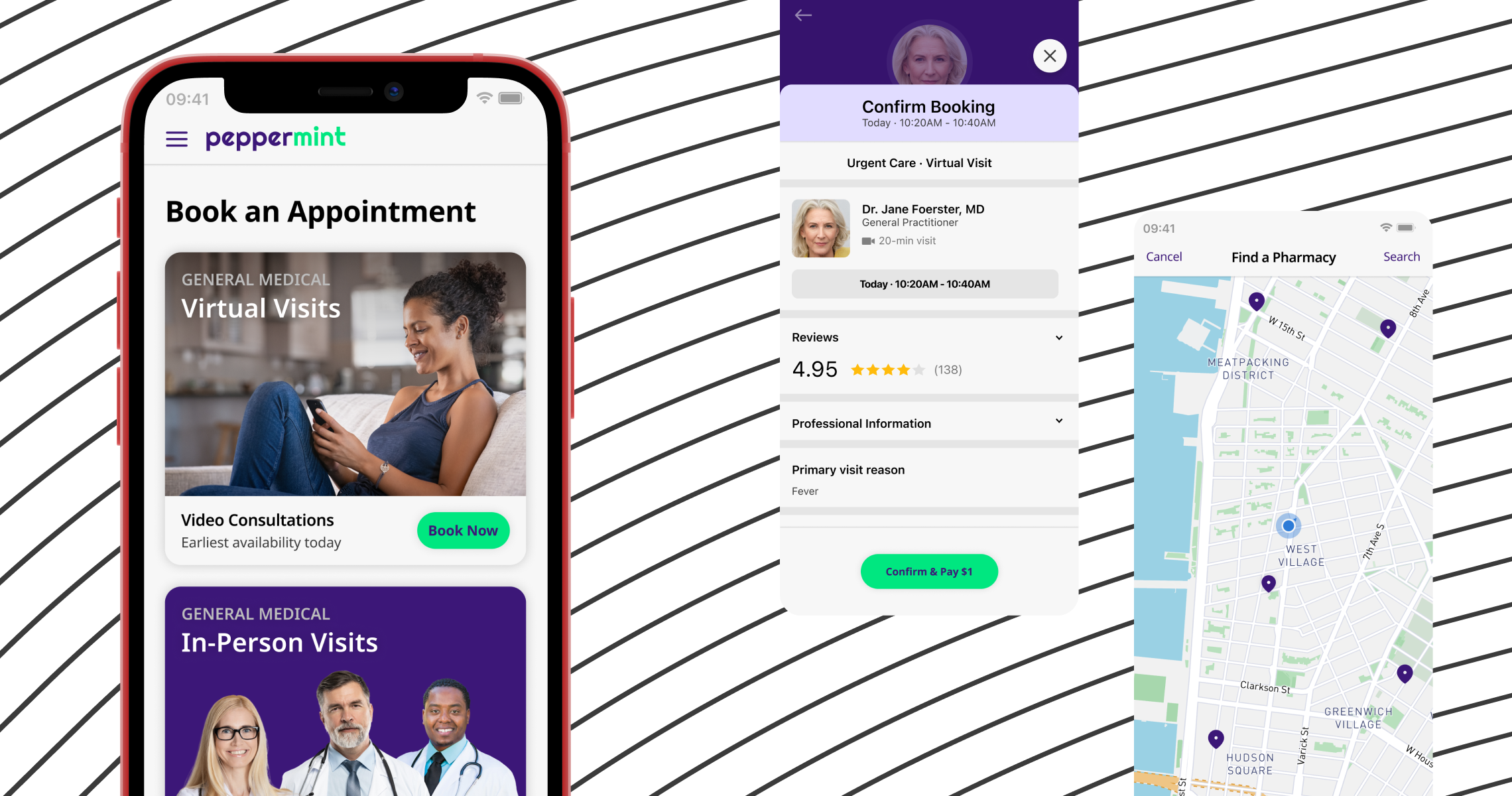
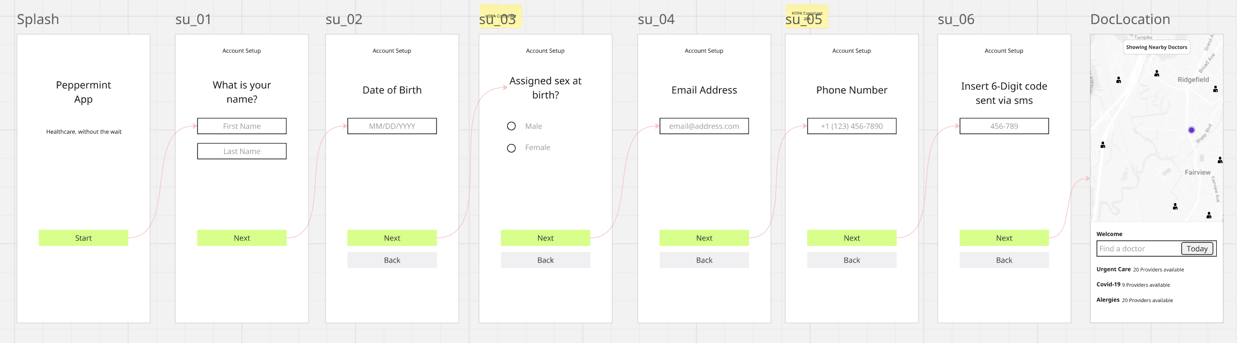
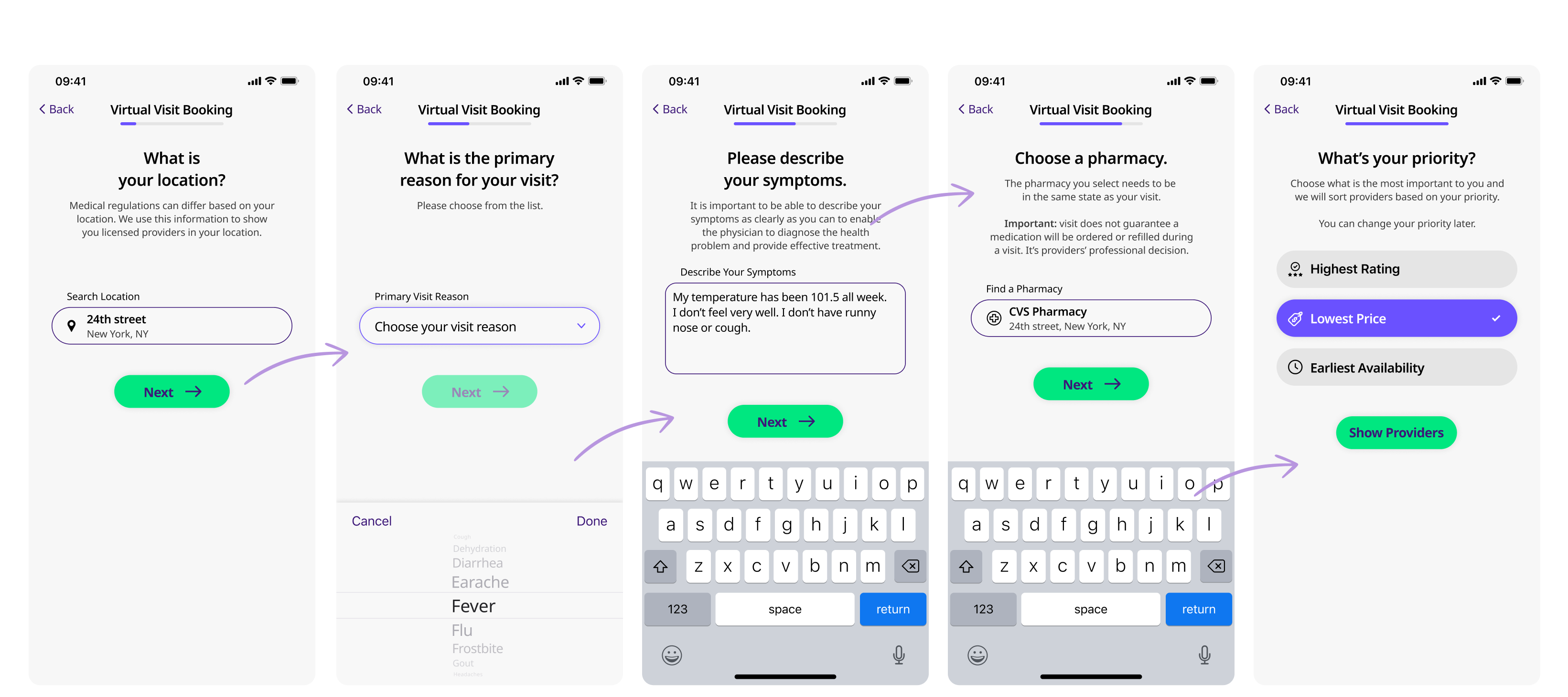
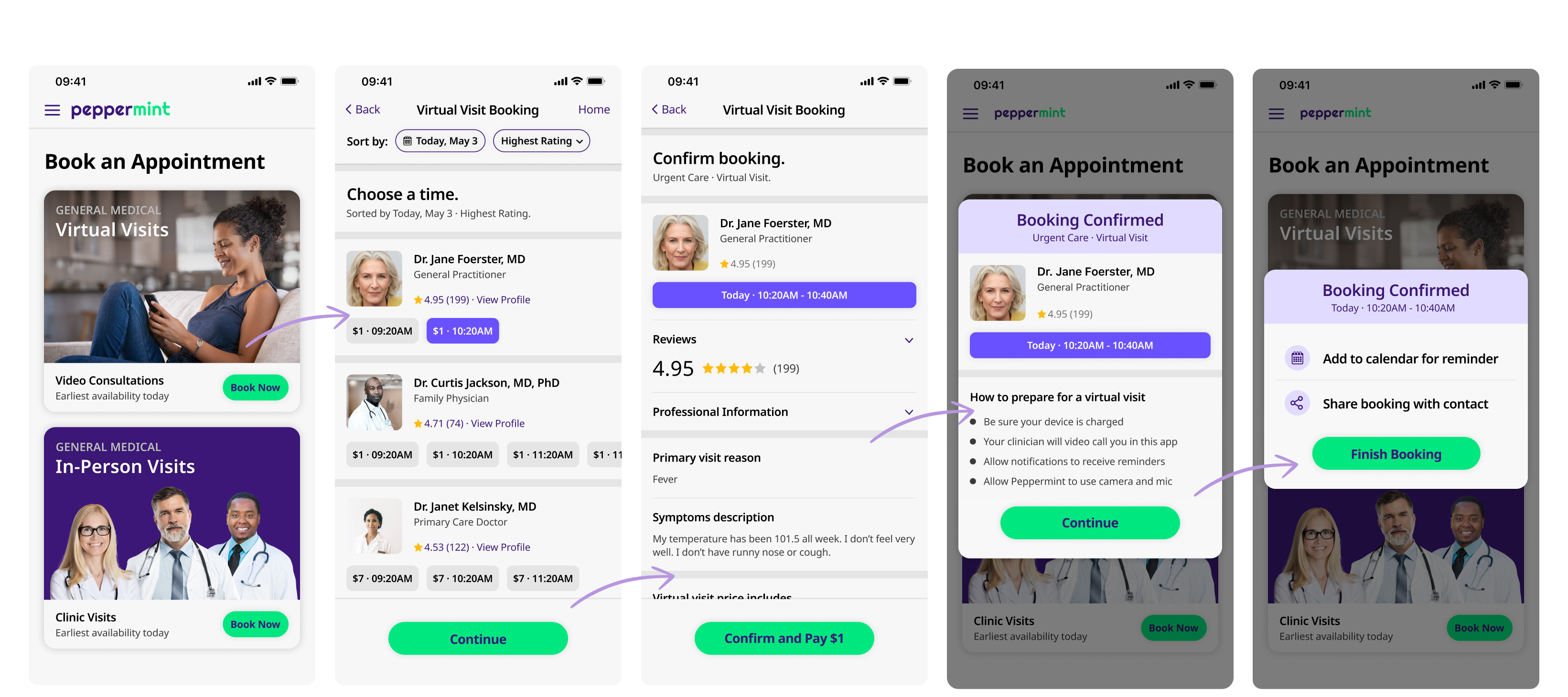
Final UI Highlights
Here are some key screens in the user journey that captures the symptom form, virtual visit flow and booking confirmation. These flows were the bedrock for MVP 0 & MVP 1 release, and was the most used feature especially during covid-19 lockdown.
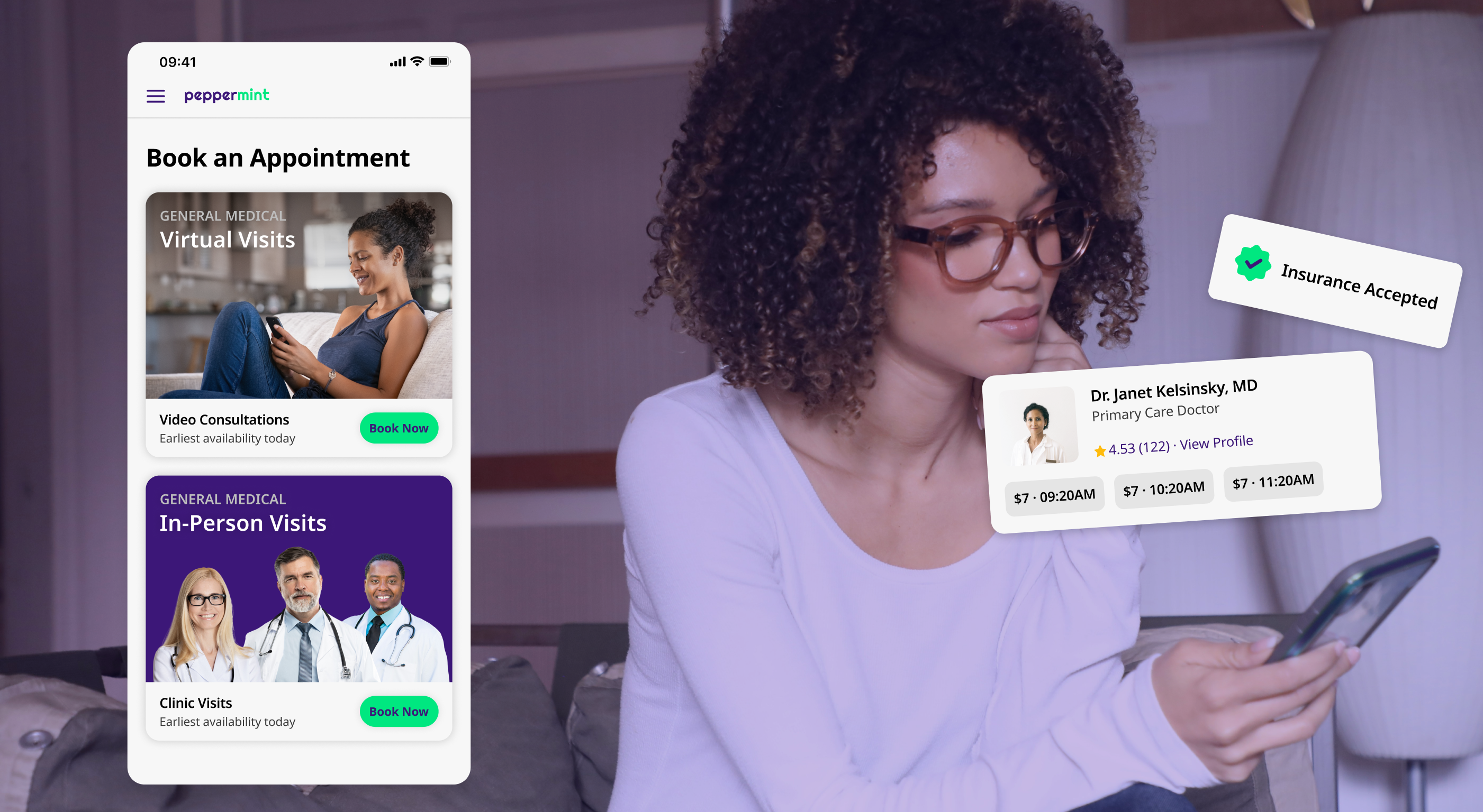
Brand Direction
Peppermint’s visual style was made to stand out from the typical look of healthcare apps. At first, choosing a bright, bold purple as the main brand color raised some doubts among stakeholders, but once it was applied in app and on the brand, they quickly supported the direction.
I paired the purple with strong green buttons and clear call-to-actions that stood out and helped users move through the app easily. This led to better results, like faster task completion and higher success rates. Purple also represents creativity, trust, and fresh ideas—making it a perfect match for a company aiming to modernize healthcare in a smart, tech-friendly way.